wall of frames
One of the great things about CVWmedia’s diverse client roster is that we have a lot of opportunities to try out new things and see what happens. Such is the case with the Western Kentucky University Symphony Orchestra.
Flash back to 2019 when WKU director of orchestras Dr. Brian St. John, a longtime client of CVWmedia (and longer-time personal friend of mine) approached us with the idea of creating symphony performance posters that reference vintage rock album covers. Since then, the concept has expanded to iconic movie poster concepts.
Thirteen (and counting) designs later I thought now would be a good time to look back at my coworkers’…work. Below is my totally unscientific and arbitrary CVWmedia Wall of Frames. In fact, while I’m at it, let’s bring in the man himself: Dr. Brian St. John, my all-time favorite maestro, to give us a backstage pass, of sorts. So without further ado, here are my top five concert posters:
wall of frames: number five
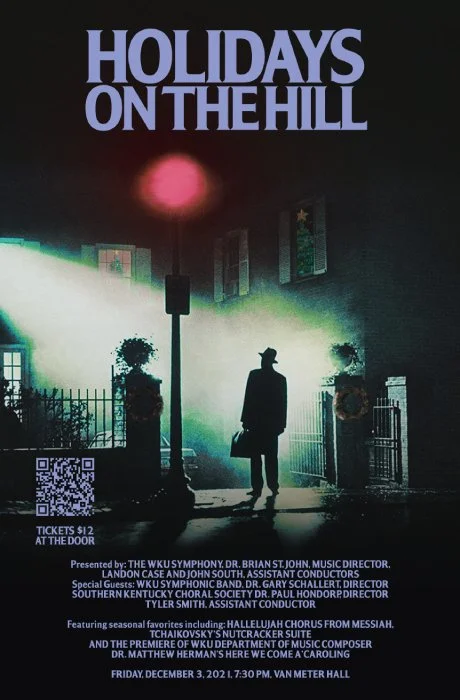
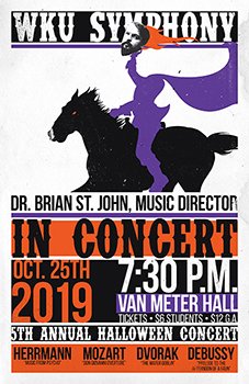
Kevin: This one’s so well executed it kind of makes your head spin. The concept flowed from the gates of your mind right into our inboxes, and the rest is history.
Brian: Yes, that poster is a real head-turner! The idea behind it is that not everyone sees the holidays as a festive time of year. While some might be, um, possessed by the spirit of the season, others might not. Plus, it's an unexpected source for a movie poster for a holiday-themed concert. A close second was riffing on Christmas Vacation or perhaps even A Christmas Story (which is a movie for which I never understood the appeal).
wall of frames: number four
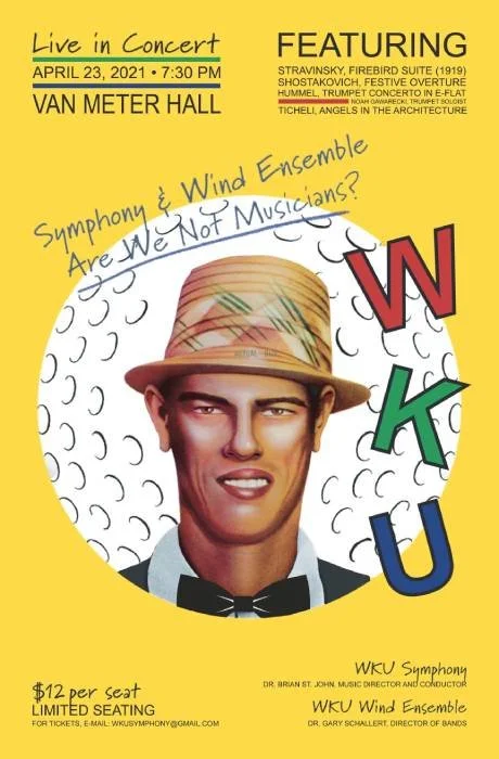
Kevin: Sometimes the process of implementing a concept that comes straight from the fire of imagination in a client’s head can be sloppy, but this one’s simple and straightforward. Perfect. Pure satisfaction.
Brian: While all the posters might be self-indulgent on some level, this is the only one that I submitted solely because I wanted to base a poster on it. Putting the image of Chi-Chi Rodriguez in a tux shirt and bow tie was a master stroke on your end—I wouldn't have thought of that.
Kevin: Me either, and that’s why it’s probably for the best that I run numbers and plan company cookouts while other people create our work.
wall of frames: number three
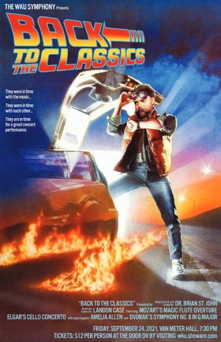
Kevin: If my calculations are correct, it took precisely 1.21 minutes for WKU Symphony members to hang up every poster they had around campus. That’s the power of teamwork. I could go on, but I gotta get back to my top five poster list, so what’s the story on this one?
Brian: The source image was the motivation for the season-long theme of famous movie posters as source material. When I first saw that original image, I immediately thought of "Back to the Classics" since it was going to be our first concert back together after a summer break and a season of platooning the orchestra due to campus-wide COVID-19 regulations. Putting Dvorak's face in place of Michael J. Fox's made the whole poster work. The three bullet-point-style phrases on the left side of the poster poke gentle fun at the Symphony's practice habits.
wall of frames: number two
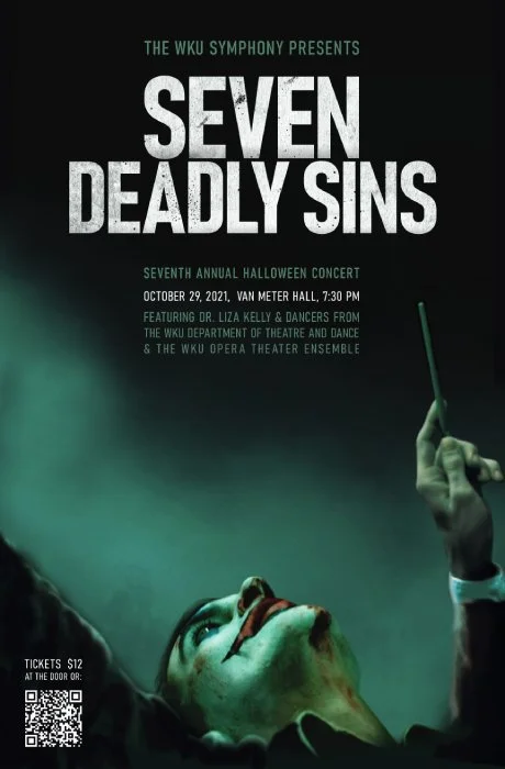
Kevin: No joke, when Morganne added a conductor arm to this design it gave me a nice, big happy face. I mean, look at it; isn’t it beautiful?
Brian: Well yeah!?! When I showed the poster to my graduate assistant and mentioned that CVWmedia had added an arm and a baton to the original Joker poster, and then pointed out that it made the Joker left-handed (rare in the conducting profession), my graduate assistant quipped, "Well, that makes him even more sinister."
The word "sinister" has its roots in the description of evil things--the opposite side from the right hand of God, as it were. Those origins have over time associated left-handedness with evil things, too. The musical marking "mano sinistra" instructs players to use their left hand (think of a left hand plucking on a violin or a left-hand crossing over a right hand on the piano). When I complimented him on his spontaneous, witty linguistic pun he replied, "I did what, now?"
Kevin: See, now that’s what I’m talking about. So glad we could help.
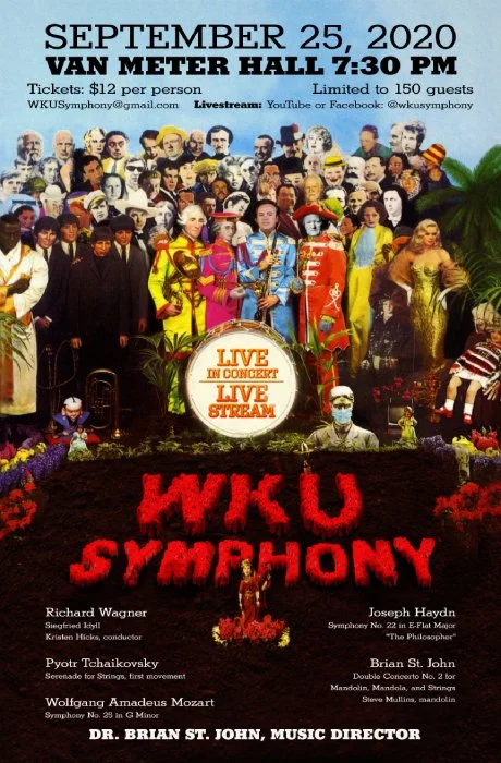
drumroll please… wall of frames: number one!
Kevin: Obviously there’s a lot going on here, but what puts this one over the top is you, front and center.
Brian: This is the one that I would have LOVED for the images in the background to have been populated with WKU Symphony musicians, but time and COVID-19 contact restrictions prevented me from shooting over a hundred close-range photos. Still, I am honored to be standing next to Haydn, Mozart, and Wagner.
Kevin: Indeed, and yes, you look all like Billy Shears getting by with a little help from your friends. You have to admit, it doesn’t get any better than that.
So there you have it, the CVWmedia wall of frames. And now here are the best of the rest:

